The portfolio that had to stop being charming
Six iterations, from an animated expedition map to an evidence-led case-study site — and the same lesson the products taught.
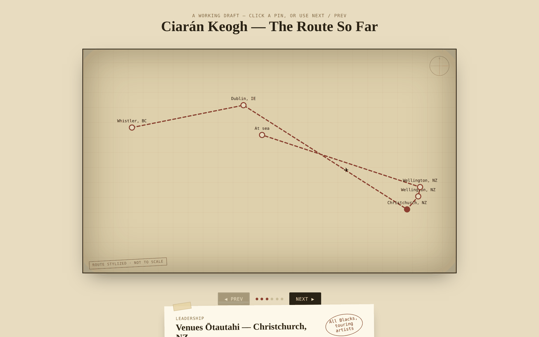
It said: here is a man who has had an adventure. What it needed to say was: here is someone who makes operations less chaotic.
Sec. 01
Context and operating scale
The hospitality case studies on this site describe work done for an employer, with the artefacts withheld because they belong to someone else. This one does not. The site is the piece of work here I can show completely: every iteration, every wrong turn, every correction.
It also happens to be the clearest demonstration of the method, because the subject matter was me and there was nowhere to hide.
Sec. 02
The real problem
The first version was an animated route map. A dashed line travelled between Whistler, Dublin, Christchurch and Wellington while a small aeroplane followed it. Pins opened scrapbook cards with taped corners, typewriter type and hand-drawn accolade stamps. It was called The Route So Far.
It was genuinely charming and it was arguing entirely the wrong thing. It said: here is a man who has had an adventure. What I actually needed it to say was: here is someone who makes operations less chaotic.
Worse, an adventure story invites you to be impressed. A systems argument invites you to check. Those are different postures, and only the second one leads to work.
Sec. 03
My role
- Every decision on content, structure, argument and visual direction
- Fact-checking and correcting my own claims, repeatedly
- Deciding what could not be published, and why
- Built using AI development tools, which is stated plainly on the product case study too
Sec. 04
What I designed
Six iterations, each removing something the previous one was proud of.
The route map
Can a career be walked through rather than read?
A grid-paper stage, a dashed route drawn segment by segment, pins that opened taped scrapbook cards. Prev and next buttons, progress dots, an aeroplane travelling the line.
- What it proved
- Sequence is genuinely the right frame for this career. Each place taught something the next one needed, and showing them in order makes that legible.
- What was still limited
- Everything memorable about it was the packaging. Ask what a visitor actually learned and the answer was: he has worked in some interesting places.
- What it made me ask next
- Can the geography carry real information rather than decoration?
The real world map
Does putting the route on a true projection make it mean more?
The abstract stage was replaced with an equirectangular world map, positions calculated from real latitude and longitude, and the pins became polaroids with tape and captions.
- What it proved
- Correct geography is more honest than a stylised one, and it cost nothing to do properly.
- What was still limited
- It also depended on an externally hosted map image, which is a dependency a portfolio should not have. And it made the underlying problem worse rather than better: now it was an accurate map of an adventure.
- What it made me ask next
- Can I own every asset on the page?
The drawn map
Can the whole thing be self-contained?
The external map was replaced with hand-drawn SVG continents and a graticule. No third-party requests, nothing to break, the entire page renderable from one file.
- What it proved
- Owning every asset is worth a small loss of fidelity. This is the same instinct that later put the fonts, the images and the content all inside one repository.
- What was still limited
- Three iterations in, and the honest summary was still: a beautifully made map of somewhere I have been.
- What it made me ask next
- What is this page actually for?
The Living CV
What if biography and geography become the interface?
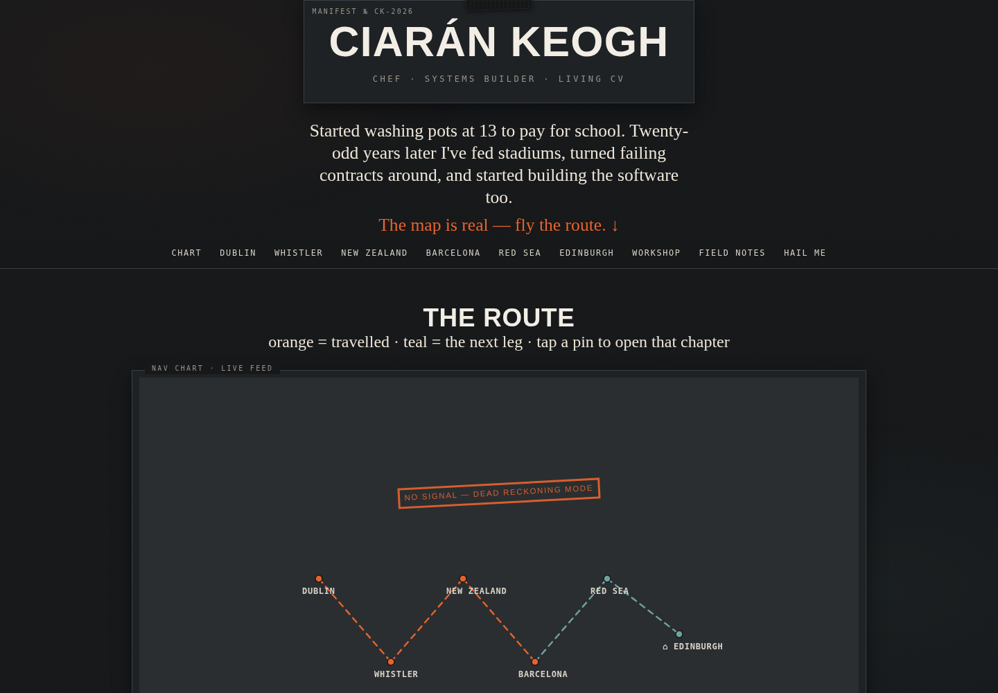
A data-driven experiment organised around biography and geography: interactive route, fly-the-route behaviour, career chapters, workshop projects and an offline dead-reckoning fallback. It made the career more explorable, but it also made the underlying problem obvious — biography was still the wrong organising principle.
- What it proved
- The site could turn a conventional chronology into an experience without losing the underlying data structure.
- What was still limited
- The map was memorable, but the reader still had to infer what I actually do and why the work matters.
- What it made me ask next
- Lead with capability, method and evidence; let biography support the argument rather than become the navigation.
The expedition portfolio
What if the map is only the opening, and the work sits underneath?
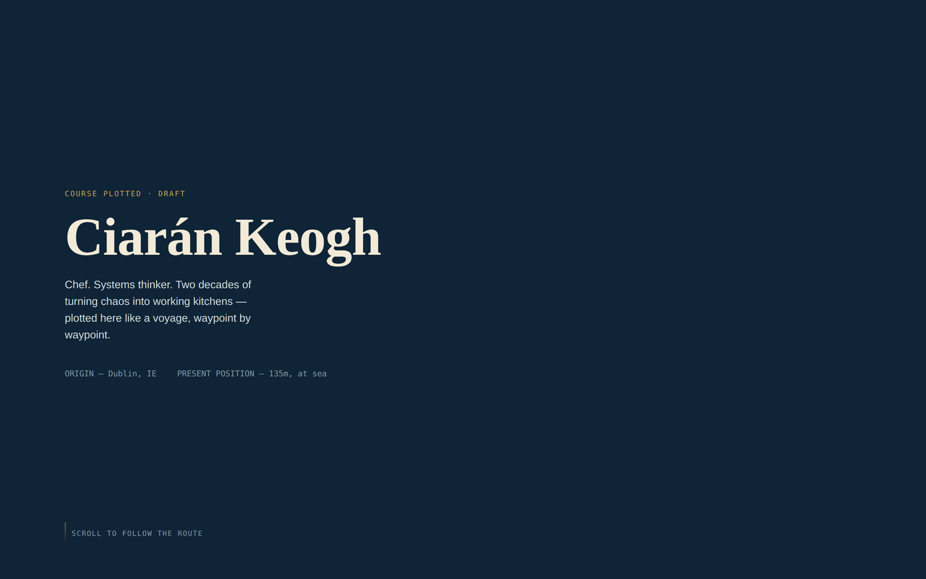
A full portfolio: the chart at the top, then an expedition log running down the page. Parchment, serif capitals, a compass rose, and the line I still like — from the pot-wash, outward.
- What it proved
- The career narrative held up once it had room. The line about starting at the bottom is true and it belongs on the site; it survives on the About page today.
- What was still limited
- The aesthetic was fighting the argument. Antique treasure-map styling says romance, and everything I was claiming underneath was about removing romance from operations. A prospective client reading it would have enjoyed it and then hired someone else.
- What it made me ask next
- What would this look like if the design agreed with the content?
The current site
Can the design carry the same argument the work does?
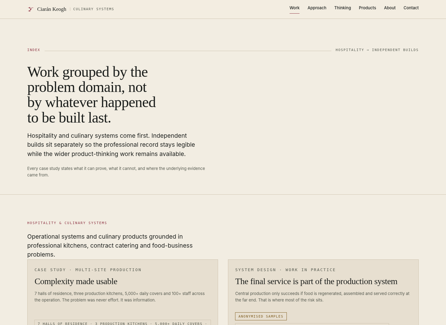
Editorial rather than antique. Hairline rules, figure numbers, mono labels — the visual language of an operating manual rather than a travel journal. Claims declare their evidence level, recurring facts live in a canonical JSON layer, and the Work index now separates professional hospitality systems from independent builds.
- What it proved
- The design can carry the same argument as the work: clear hierarchy, visible evidence and structured source data rather than a collection of hand-edited pages.
- What was still limited
- The site can still accumulate too much. Adding a project is easy; deciding what deserves prominence is the harder editorial job.
- What it made me ask next
- Keep the source structured, keep the professional story legible, and use recovered iterations as evidence rather than as extra clutter.
Sec. 05
How it was used
The site was built almost entirely on a phone, in sessions between contracts. That constraint shaped it: everything is plain text and JSON, there is no build framework, and the whole thing is a Python script that turns content files into HTML.
It deploys as a folder. No database, no CMS, no runtime. If every tool used to build it disappeared tomorrow the site would carry on working, which felt like the right property for something whose argument is about systems outlasting the person who made them.
Sec. 05b
Building the checks, not trusting the reading
The interesting part of building this was not the design. It was accepting that reading your own work does not catch things.
A portfolio makes hundreds of small factual assertions — dates, titles, figures, which role a piece of work belonged to — and every one of them can drift as the document grows. Proofreading finds some. It reliably misses the rest, because the reader already knows what the sentence was meant to say.
So the checking got automated. Content QA validates canonical fact references, project IDs, image references, internal links, heading structure, alt text and known stale claims before a release can pass. A separate browser pass then loads every generated page at 390, 430, 768 and 1440 pixels and fails horizontal overflow, with targeted regression checks for layouts that have broken before.
None of that is sophisticated. It exists because the alternative — a person carefully looking — is exactly the control that fails under time pressure, which is the argument the rest of this site makes about kitchens.
The same logic drove the content architecture. Recurring facts, project routing, career records and document copy now live in structured JSON; the site, CV and capability statement render from those records. Presentation code decides how the material appears rather than becoming another place where the career is rewritten.
Sec. 05c
Structured content, three outputs
The website, CV and capability statement draw from the same structured content layer. Recurring claims such as operating scale, awards and qualifications have canonical fact records, while each output selects only the material it needs.
That is not tidiness for its own sake. Earlier builds allowed document-specific prose to live inside the PDF generators, which meant the website and downloadable documents could drift even though they appeared to share a source. In the current architecture, Python renders; it does not own the career facts.
Project routing and grouping are also registered once. Case-study files hold the narrative, while the project registry decides where work appears and whether it is professional hospitality work or an independent build.
Sec. 07
Relevance by outcome
What it demonstrates
- Structuring an argument across a whole information product
- Evidence discipline applied to my own claims, at some cost
- Content architecture separated from presentation, with shared fact and project records
- Automated content and responsive checks built into the release process
Judgement demonstrated
- Discarding several iterations, including ones I liked
- Choosing an aesthetic that agrees with the content over one that flatters it
- Publishing the wrong turns rather than a polished retrospective
- Stating what cannot be evidenced instead of quietly implying it
The pattern, again
- Chef's Bible to The Spicy Noodle: eight preserved builds, narrowed through use
- This site: six documented design directions, progressively organised around evidence rather than biography
- In both cases the useful version arrived by removing ambiguity, not simply adding features
What is still wrong with it
- The homepage still asks for ruthless editorial restraint as new work is added
- There is no need to pretend every experiment deserves equal prominence
- Some operational samples are reconstructions because the originals are not mine to publish
Sec. 08
Evidence ledger
Each statement on this page sits at one of five levels. Measured means recorded and quantified at the time. Documented means a retained artefact or record exists. First-person account means it rests on Ciarán's own testimony with no external corroboration. Inferred means it is reasoned from the design rather than shown by data. Not claimed means the page is explicitly not asserting it, and says why. Nothing is published above the level its evidence supports.
Six documented design directions are represented, including the recovered Living CV iteration.
Release QA validates content references, generated markup, internal links and representative responsive widths.
Built using AI development tools, with all content, structure and argument decisions mine.
That the current version is better than the map versions.
My judgement, and that of two reviewers. Not tested against visitors.
That the site generates enquiries.
Too early to say.
The current build pipeline validates project references, recurring fact records, images, internal links and representative responsive widths before packaging a release.
Sec. 09
Reflection and next iteration
The thing I would tell anyone building one of these: the aesthetic is an argument whether you intend it or not. Four iterations of mine argued for romance while the words underneath argued for rigour, and I could not see it because I liked the map.
The other lesson is the one this whole site is about. Careful reading is not a control. If something matters, build the thing that checks it — which is what a regeneration standard is, and what a batch-tracking system is. It turns out it applies to a portfolio too.
Sec. 10